
Welcome back, and I hope you have been enjoying summer so far!
It is time for another treat about all-weather strategies, and this time around, I have something special in store. Namely, I have had a closer look at historical performance of risk parity portfolios when compared with that of the S&P 500.
I was actually quite surprised by the results and it is with great excitement and pleasure that I can share my findings with you, hoping that you find it useful for your wealth management endeavours. This strengthens my convictions in using risk parity investment strategies.
I hope you will enjoy reading this article as much as I enjoyed writing it.
Earlier this week, I received a very good comment to the article which I published last month. In that article, I discussed how the stock market seems greatly overvalued based on several widely different indicators, measuring both listed stock’s earnings and assets, as well as market cap in relation to GDP.
Based on the indicators CAPE (Shiller’s PE), Q Ratio, and the Buffett Indicator (market cap to GDP), future potential returns of the stock market over the next decade appear limited.
In the light of this, the question arises whether the All Seasons Portfolio would be a better choice, and how it has performed under similar conditions in the past when compared with the S&P 500. The comment reads as quoted here below and this is what I have set out to answer in this month’s article.
“Hi Nicholas, these are interesting thoughts. But would it be possible to find some graph that compares the performance of All Seasons and S&P 500 in the last 50 years? It can even have the end date set to the bottom of 2008 crisis to see the worst-case scenario.”
Comment by Tomas to the May 2021 portfolio update post
We can anticipate that future returns of the stock market will be below what we have become used to in recent years based on these metrics, and the fact that returns 1) usually are clustered in a way that good years are followed by further good years and bad years are followed by further bad years, and 2) always regress to the mean (between 7-10% annually) and that the last decade has seen annual returns far above this level.
When acknowledging the current worrying state of the equity markets, it becomes relevant to further understand how the All Seasons Portfolio has performed versus the stock market under similar market conditions.
As correctly pointed out by Tomas, the period since the Great Financial Crisis of 2007-2009 until is not a representable era for a comparison of the long-term performance of the All Seasons Portfolio against stocks. This last decade has been incredibly favourable for stocks with low inflation, positive economic growth and decreasing interest rates (discount rates).
Instead, it is relevant to compare against 1) long-term performance over several decades, and 2) periods with similar conditions as where we are currently. To me, these are two extremely central questions to clarify, and that I wanted to have answers to as well.
While I as eager to get down to find historical data for the All Seasons Portfolio, there are some challenges in this for several reasons. The three key challenges are that:
- TIPS as an asset class was only introduced as an asset class in the US in 1997 and in the UK in 1981. Data from earlier periods is thus hard to find;
- During the Bretton Woods system until 1971, the USD was linked to gold, meaning that data for the gold price prior to that date may be distorted depending on data source;
- The popular free tool for portfolio analysis and back-testing, Portfolio Visualizer, does not have information on Commodity indices over longer periods of time. For Portfolio Visualizer’s asset allocation back testing service, this only goes back to 2007.
There are tools that can provide historical data for both TIPS and Commodities further back in time. For example, the GSCI (Goldman Sachs Commodity Index) dates back to 1967, and data further back can be artificially constructed, and for TIPS Bridgewater has simulated synthetic historical data from 1927. These data have, unfortunately, been difficult to obtain when I was writing this blog post.
Having felt a bit disappointed over these difficulties, I was not completely deterred. I started off looking at the data I had easily at hand, by doing a comparison between the All Seasons Portfolio and the S&P 500 from 2007 on Portfolio Visualizer. I will show you my findings there in a minute.
Then I remembered that in Alex Shahidi’s book, Balanced Asset Allocation, he lays out historical data for his example portfolio – the Balanced Portfolio – which is built on the same principles as the All Seasons Portfolio.
The Balanced Portfolio also solves all the above issues:
- Shahidi has had access to Bridgewater’s historical synthetic TIPS data from 1927;
- It uses commodities as an asset class rather than splitting it between commodities and gold, circumventing the gold standard issue; and
- He has access to GSCI data and commodity data from before 1967.
I found the web resource of the data of the Balanced Portfolio’s excess return over the risk-free rate and I will showcase you the findings further below. I then only had to construct the corresponding data for the S&P 500. This was an easier task, as I found historical data on Robert Shiller page on Yale university’s website, complete with inter alios both stock market data and the risk free rate from the late 19th century. Having pressed ‘enter’ on my =Average formula in Excel for the performance 1927-2014, I was quite astonished by the findings. But I am getting ahead of myself, as you will learn more about this here below.
The last thing that then remained was to compare the Balanced Portfolio with the All Seasons Portfolio, to better understand how well the Balanced Portfolio works as a proxy in this historical review. For this last part, we will again turn to Portfolio Visualizer for a comparison since 2007.
Now then, let’s look at some data!
All Seasons Portfolio vs. S&P 500 – Portfolio Visualizer, 2007-2021
Beginning with a comparison of the most recent performance, we turn to Portfolio Visualizer for analyzing the All Seasons Portfolio’s returns against the S&P 500 since 2007. We use indices rather than ETFs, and for this comparison we assume semi-annual rebalancing of the All Seasons Portfolio.
Click images to enlarge


As recognized earlier, the compared period (2007-2021) has been a time which has been particularly positive for equities with decent economic growth and low inflation. This of course means that over this examined decade, stocks will of course outperform the All Seasons Portfolio, and it is therefore important to note that short comparison periods are not statistically significant. A discussion about this topic was included in the May 2021 portfolio update article.
However, we can still draw some conclusions from the data:
- Volatility has been much lower for the All Seasons Portfolio, which also has a better Sharpe ratio and a more stable rising line in the graph.
- In March 2020 in the Covid-19 market decline, the S&P 500 and the All Seasons Portfolio had had almost return since 2007. However, the stock market thereafter bounced back and has seen greatly positive performance since then.
- A CAGR of 7.45% for the All Seasons Portfolio is more than acceptable return for a low-risk portfolio.
- Max drawdown has been significantly lower for the All Seasons Portfolio than for the S&P 500 (-16% vs. -51%)
Combining these factors, even though we have witnessed an environment where stocks have been thriving, there are many advantages of the All Seasons Portfolio. Stability and certainty are important traits for most non-professional investors as the most significant risk we face is that our wealth will not be as great in the future as we would have wanted or needed it to be, for example to fund a retirement.
But more importantly, we now have the benefit of hindsight. We now know that the S&P 500 has had a strong decade, but if you would have been quizzed about it 10 years ago, you could not have predicted the future.
We are in that same position now: can you with certainty say that stocks will see another decade with a CAGR above 10% until 2029 or is such performance more uncertain? I touched on this already in the May 2021 update for which the comment relates, and it is in this light that longer-term historical data is interesting. You cannot predict, but you can prepare.
Historical performance of the All Seasons Portfolio 1927-2014
To be better equipped to answer our question if the All Seasons Portfolio is a good bet in comparison to the S&P 500, we would ideally have data for two main periods: 1970-1980 which was the last time inflation hit double-digit numbers in the US and commodities boomed, and 2000-2008 which saw the last super-cycle in commodities.
What I have been able to find, however, is a comparison between the “Balanced Portfolio” set-out in Alex Shahidi’s book Balanced Asset Allocation and the S&P 500 when looking at excess return over cash.
Unfortunately, I have not been able to develop a “traditional” performance chart of this portfolio, but instead we will be looking at annual excess return over cash, which I will describe shortly. I will also do my best to recreate this exercise sometime in the future with the actual All Seasons Portfolio rather than using the Balanced Portfolio as a proxy.
As a background, the Balanced Portfolio resembles the All Seasons Portfolio, as it is built with the same methodology and is based on the same theory of risk parity between seasons of the economy (the four boxes).

The asset allocations between the two portfolios differ somewhat though. For the Balanced Portfolio, the assets and their weights are set out as below:
- 20% equities
- 20% commodities (including gold)
- 30% long-term treasury bonds
- 30% TIPS
As a reminder, the typical All Seasons Portfolio (from which I have deviated with some minor adjustments) is built as:
- 30% equities
- 7.5% commodities
- 7.5% gold
- 40% long-term treasury bonds
- 15% TIPS
For the Balanced Portfolio, Shahidi has retrieved performance data from 1927 to 2014 (the book’s year of release). But remember what I stated earlier that data for TIPS did not exist before 1991? A clarification is in order here that while TIPS were not available, the two main components that determine its price were: CPI and treasury yields. From this information, Bridgewater Associates have been able to simulate the performance of fictional TIPS for enhanced backtesting, which is the data used by Shahidi.
For determining the Balanced Portfolio’s performance, excess return is used as the performance metric. This is simply defined as the annual return over the risk-free rate and is calculated as annual return minus the yield of short-term bonds. In other words, this measures the compensation an investor receives for the increased risk of holding financial assets rather than cash equivalent investments that are risk-free. It is thus a great metric to use for comparing different investment strategies over time, as we will find out if you get compensated for having taken more risk, or if the risk/reward relationship would be better for alternative investments.
For the 87-year period, the average annual excess return of the Balanced Portfolio amounted to 4.4%. This is, in itself, rather decent compensation for a diversified low-risk portfolio.
As an interesting sidebar, notably, the weighted average annual return of the four asset classes was only 3.4% over the period, but the “extra” 1% in annual excess return is the rebalancing premium added from automatically buying low and selling high from annual rebalancing of the portfolio. You can also read more research and insights about Rebalancing Premium for risk parity portfolios in ReSolve Asset Management’s paper on this subject.
In respect of Shahidi’s work, as the data is a password protected resource available for those who have purchased his book, I will not be publishing the year-on-year data. You will however find the annual excess return in the chart further below.
But the question here was how has a risk balanced portfolio fared against the stock market? This information was not readily available on a year-on-year basis in Shahidi’s book, but I have sourced this from Nobel laureate Robert Shiller who presented various data for the economy from the late 19th century. Here, I found the annual return of the S&P 500 and the short-term interest rate, from which the annual excess return was derived. You can find the data here: Online Data – Robert Shiller (yale.edu)
Including dividends, the excess return for the S&P 500 market for the period 1927-2014 was 7.58%. This number deviates somewhat from the one presented by Shahidi in his book (5.6%), but could probably be explained by the interest rate used for cash. Shiller presents a composite of January and July 6M Treasury Bonds, while it is not entirely clear what rate (shorter- or longer-term bonds) Shahidi used in his calculations.
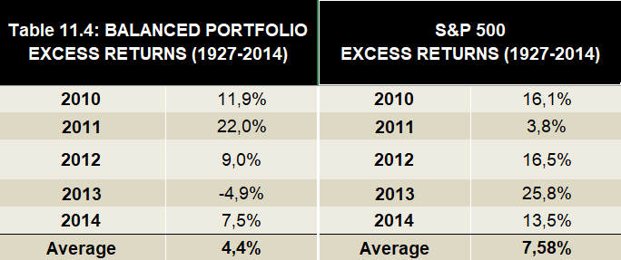
The stock market is thus, over time, a better investment than an unlevered Balanced Portfolio in absolute terms. Where the Balanced Portfolio shines is, however, not in the absolute return column, but rather the stability of excess returns.
As you will see from the chart below, the annual returns of the stock market fluctuates much more than those of the Balanced Portfolio, which is moving much closer to its mean.
Additionally, most of the years with highest excess returns of equities occurred in the 30s and 50s, but also the years with the worst returns occurred further back in time (save for 1973-74 and 2009). At the same time, the returns of the Balanced Portfolio are more evenly spread across the whole period.

This is also clearly visible when comparing the standard deviations (a measure of fluctuations in returns) and Sharpe ratios of the two investments. For stocks, the standard deviation for the period was 6.46% with a Sharpe ratio of 1.23, while the corresponding figures for the Balanced Portfolio were 1.49% and 5.08, respectively.
The conclusion is thus that the spikes and dips of the excess returns are much greater for the S&P 500 than for the Balanced Portfolio, which is the result of that stocks are more volatile than a portfolio that is well diversified between asset classes, while the standard deviation for the Balanced Portfolio is lower.
This is explained by the relative cycles of the assets included in the Balanced Portfolio. As an investor, you will benefit from the sum of the risk premium of each asset as losses in one asset class is offset by gains in another, and rebalancing premium from regularly selling assets at relative highs and buying assets at relative lows.
Tying back to the May 2021 article, as you will never be able to predict whether the next few years and decades will be good or bad for stocks, you are wiser to diversify your portfolio to be ready for a slow market, such as the decade from 2000 to 2009.
The examined data is for an almost 100-year period, but realistically, no investor alive today will be part of the financial markets for that long. Most of us begin to save and invest around our 20s, and start withdrawing in our 60s, meaning that on average, we have around 40-45 years to compound as much capital possible.
If you would be 100% allocated to stocks, and have bad luck with your timing so that more than 20 of your 45 years in the market are subpar, that will hav disastrous consequences for your future wealth. It is thus better for most to decrease risk and diversify more.
I was not too surprises by these findings. 4.4% vs. 7.2% average excess return is an expected difference. However, what surprised me was how close to the mean the Balanced Portfolio moved across the whole period. This was just a whole other level than the stock market, and is especially visible when comparing standard deviations and Sharpe ratios. The key benefit of portfolios similar to the All Seasons Portfolio and the Balanced Portfolio is that they deliver superior risk-adjusted return.
While the chart already tells us a good amount of information about the relative performance of the All Seasons Portfolio, our question was more specifically “how does the All Seasons Portfolio compare against the S&P 500 in the 1970s and the 2000s”, i.e. during periods when inflation was rising and when we last saw a commodity super-cycle?
1970s and the period of double-digit inflation in the United States
From the chart, we can see that from 1972 until 1983, the Balanced Portfolio outperformed the S&P500 when looking at the average excess return over this period.
However, neither have particularly strong excess return, as the short-term interest rate was heavilty increased by then Fed chairman Paul Volcker and culminated at 20% in 1981 to curb the then high inflation, meaning that both the Balanced Portfolio and the S&P 500 would have needed to return more than the short-term rate in a year to show positive excess return. Such returns are a tall order in any year.
It was only by 1983 that inflation again dropped below 3%, even though the short-term rate remained above 10% also for the subsequent year.
But the relative performance of the Balanced Portfolio was still good through this period, as the annual average excess return from 1972 until 1983 was +1.7%, while the same metric for the S&P 500 was 0.4% – a difference of 1.3 percentage points. Hence, a stock investor would not have been as well compensated by the higher risk attributable to equities, as it barely returned more than cash through this 11-year period.
Not even the Balanced Portfolio was immune to bad years during this time, as it returned -16.1% in 1981 (-21.2% for the S&P 500) when the short-term rate was at its peak, but the portfolio still outperformed cash through the decade.
2000s and the last commodity super-cycle
The history rhymed also in the last commodity boom from 2000-2014. While rates never spiked as they did in the 70s, the Balanced Portfolio outperformed stocks again over this period: +7.0% average annual excess return vs. 4.2% for stocks.
This relationship between the Balanced Portfolio and the S&P 500 holds true even if we exclude the deepest declines of the Great Financial Crisis (but include the dot-com bubble as a period as short as 5 years is meaningless for drawing any conclusions). From 2000-2007, the Balanced Portfolio rewarded its investors with an average excess return of +7.5%, while the S&P 500 returned only a meager -1.0%.
50 years until 2008
In his comment, Tomas specifically asked about the performance of the All Seasons Portfolio against the S&P 500 for a 50-year period until the Great Financial Crisis. As we have compiled the data, we might as well answer this question as well.
For this period (1959-2008), the average annual excess return of the Balanced Portfolio was 3.8%, which is somewhat lower than the long-term average of 4.4%. However, the corresponding number for the S&P 500 was an even worse deviation from the long-term average: 4.0%.
This means that for the last five decades, the average annual excess return of the Balanced Portfolio has been at par with the S&P 500 including dividends. Now, that is something to think about.
All Seasons Portfolio vs. Balanced Portfolio
I recognize that the above comparison is between Alex Shahidi’s Balanced Portfolio and the S&P 500, but that we are mostly interested in the All Seasons Portfolio. While these portfolios are built with the same premises in mind, they are not identical.
Let us therefore compare them best we can with the data we have available, i.e. from January 2007 until June 2021 to attain a better understanding of their similarities and differences.


While I do not have the exact number easily available, from the graph and data, we can determine that the correlation of the All Seasons Portfolio and the Balanced Portfolio is high.
However, at least for this particular analyzed period, the All Seasons Portfolio has been a better performed with a CAGR of 6.73% compared to 5.41% of the Balanced Portfolio.
This is mainly explained by the differences in composition where the All Seasons Portfolio holds 30% in stocks vs. 20% in the Balanced Portfolio, 15% in commodities, as opposed to 20% in the Balanced Portfolio, and 40% long-term government bonds, as opposed to 30% in the Balanced Portfolio.
The recent developments over the past decades in these asset classes have all favoured the All Seasons Portfolio, as stocks have performed well, commodities have performed worse, and long-term treasury bonds have performed well in the race down toward zero-interest rate policy. Thus, the All Seasons Portfolio has been better equipped to capture these trends.
Whether this outperformance will continue over coming decades remains to be seen, and at the same time, it is a rather narrow timespan we are comparing.
In the longer run, I expect the CAGR of both of these portfolios to remain in the same ball-park with high, but not perfect, correlation.
I would also add that Alex Shahidi, the creator of the Balanced Portfolio that was used as an example in his book, now runs RPAR ETF, with an asset allocation which is more closely related to the All Seasons Portfolio rather than the Balanced Portfolio. Check out page 9 of their Q1/2021 report for more details on their asset allocation: RPAR ETF Q1/2021 Presentation (rparetf.com).

Summary – historical performance of the All Seasons Portfolio against S&P 500
Tying up loose ends, let us now answer the original question: how does the All Seasons Portfolio stack up against the S&P 500 over longer periods of time? And especially, how did it perform in past times of higher inflation and commodity super-cycles?
We have seen that the S&P 500 has outperformed the All Seasons Portfolio in the periods 2007-2021, which is the period for which data is available on Portfolio Visualizer, but the Sharpe ratio of the All Seasons Portfolio was better than that of the stock market.
For a longer perspective, from 1927, we used the Balanced Portfolio as described by Alex Shahidi in his book Balanced Asset Allocation as a proxy for the historical annual return in excess of cash and compared it with the corresponding performance of the S&P 500 as sourced from Robert Shiller’s data.
We learned that the average annual excess return of the S&P 500 from 1927 to 2014 was above that of the Balanced Portfolio (7.58% vs. 4.4%), but that the Balanced Portfolio had a much better risk-adjusted return with a better Sharpe ratio (5.08 vs. 1.23) over this period.
When specifically examining the times when commodities have outperformed and inflation has risen – a current fear among investors and economists – the Balanced Portfolio outperformed stocks in both the 1970s and in the 2000-2014 commodity boom.
We note, however, that while the Balanced Portfolio is similar to the All Seasons Portfolio, they are not identical, and these portfolios are therefore not perfectly interchangeable. But, we see that the correlation between these portfolios is high, and that over longer period of time, the results should be similar, even though they may perform differently over shorter timeframes.
In conclusion, the All Seasons Portfolio is a viable investment option for long-term returns not too far from that of stocks, but with less extreme spikes and dips, meaning that risk-adjusted return is much better. It is also a better option in times of higher inflation.
Thus, while it may be frustrating to see memestock investors (it still amazes me that this is a term…) and day traders with sloppy risk management earn money during short periods when times are good on the stock market, over longer periods, risk parity portfolios will catch up. The activities of investing and building wealth is a marathon, not a sprint. The real risk we face as retail investors is running out of money, meaning that we cannot bet all our money on one horse (the stock market).
Returning to what I discussed in the May 2021 article, the stock market is valued at high levels at the time of writing, regardless which measure is used. Hence, it is more likely today that the stock market will underperform the coming decade, as its returns regress to the mean.
If this would turn out to be true, a diversified and risk balanced portfolio is likely to be a better investment than stocks for the coming years.
I hope that you are pleased with this response to your comment, Tomas.
What remains to be researched, however, is the expected return of bonds and whether these still belong in an All Seasons Portfolio, given that it is likely that the only direction the yields can go now is up.
This is a question I still wrestle with – whether long-term bonds is now a guaranteed loosing trade, if rates can go deeply negative (steering rates below -2%) where bond convexity could give significant positive return, or if the risk/reward ratio for bonds is unacceptably low.
I do agree that in the context of a 60/40 portfolio, bonds will likely add little value, especially when considering that stocks may not be a hot asset for the coming decade either. There question thus remains for the context of the All Seasons Portfolio and other broad risk parity portfolios.
I would like to hear your input on this as well, and if bonds were to be abandoned: what would you substitute it with. This is not a simple topic, and my hope is that as a collective, we can make headway on this question. Share your thoughts in the comments, and we will continue the discussion there!
If you are looking for getting started with your own All Seasons Portfolio and need some inspiration, check out my post on How to get started with the All Seasons Portfolio strategy. While stocks have been a great investment the last decade, there are no guarantees that this trend will last, as their continued success depends on several factors. Instead, consider diversifying your portfolio to include other asset classes, and benefit from the rebalancing period over the long-term, as described in this article.

Make sure to check out my profile on eToro – the leading Social Trading platform with more than 40M users worldwide – where I have been a Popular Investor since 2020, utilising the All Seasons Portfolio strategy. There, I share monthly performance updates about the portfolio. You can also copy my portfolio and all the trades done therein, starting from $200.
If you want to check out the performance data beforehand, just head over to the Fact Sheet for my profile produced by BullAware, which is automatically updated monthly.
Thank you yet again for following my blog about risk parity investing and the All Seasons Portfolio. If you haven’t done so already, make sure to subscribe to the newsletter via the form in the page footer, and to drop any comments you may have on the content with the comment section or via email to nicholas@allseasonsportfolio.eu. The greatest value I have received from upkeeping this blog is the fantastic conversations with great people, such as yourselves, about ideas on investing and strategies. Thanks for that!
Sincerely,
Nicholas


Hi Nicholas,
thank you very much for this detailed comparison! I’m actually considering switching to this portfolio with half of my long-term (retirement) investments which are almost exclusively in stocks now. As you probably know, I already use All Season portfolio for medium-term investments (as my “savings account”). I’m just a little bit worried about bonds and their future returns. I’m still leaning towards having majority of my net-worth in stocks rather than bonds. But I can see you have the same concerns. It would be nice if we were able to find some solution how to avoid long-term bonds. Or do you think they will come back as they did a few decades ago when they also reached zero interest rates?
Hi Tomas,
I am pleased to hear that you enjoyed this post! Without providing investment advice, I can share what I do with my savings, and I have a significant share of also my longer-term savings invested with the ASP strategy.
Regarding the long-term bond conundrum, I am still digging into this. In doing so, AQR Capital Management published a very interesting article just last week (26 July) on what drives bond yields (both monetary policy and expectations of future interest rates/inflation) and with a break-down of the components of each of these. Longer-term bonds still have some way down to zero (the 20Y is currently at 1.76%), but we don’t have to see negative short-term interest rates for continuing declines in yields. That would mean that bonds still have an upside. If the UST 30-year bond would reach the same yields as German bunds of equivalent maturity, i.e. to -0.5%, there is an upside in the bond price of 75% from today’s levels.
This is just a brief summary, and I look forward to returning to this topic sometime in the future. In the meantime, I encourage looking into the paper published by AQR. The PDF can be found on their website.
/Nicholas
I voted “other” and my picks would be assets that are less correlated with everything else:
1. Healthcare and utility stocks or same type of ETFs, also consider consumper staples
2. Real Estate, but not offices – actual houses for living. Can also be through crowdfunding markets.
3. Add more gold and other precious metals, can also be in the form of stocks of companies which deal with extraction, processing etc (you get a dividend that way too)
4. Crypto (small additional long-term allocation of biggest crypto projects)
5. Commodity stocks, water stocks or ETFs.
Thanks Nikolai for the good comment!
I very much agree with that the items 1-3, as the replacement for bonds would need to be a safe-haven type of asset that does well in stock market declines (defensive stocks and gold/precious metal companies). In a deflationary environment, cash is one of the better asset to hold, why cash flow generating asset such as real estate and renting properties are a good asset, as long as you do not have to liquidate this position by selling the property in a property market where prices are declining.
Regarding crypto and commodities, I follow the logic that these assets have a low correlation with e.g. stocks, but in my book, these have the similar risk bias as stocks as they do well in times of higher economic growth, albeit with different inflation bias where both of crypto (in theory) and commodities perform well when inflation increases. But perhaps it could still make sense in certain constellations – interested to hear how your allocation would look to each of these assets (1-5)?
Nicholas